Spotify Advance
Designing the identity for the next stage of Spotify Advertising
Spotify Advance was Spotify’s inaugural advertising event in NYC, bringing together leaders across marketing, media, technology, and creativity to unveil the next evolution of Spotify’s advertising platform. The event introduced new ways for advertisers to buy, create, measure, and drive results on Spotify.
ROLE
Art Direction • Visual Identity • Graphic System • Event Design • Digital • Motion
The Solution
The Challenge
Turning “Advance” into a visual idea
Rather than treating Advance simply as an event name, we used it as the foundation of the visual language.
Advance means movement. Direction. Progress. Transformation.
That created an opportunity to build an identity around pathways—visualizing ideas moving forward, changing direction, connecting, and ultimately taking shape.
This connects directly to our original concept statement about fragmented directions gradually becoming clearer and more structured.
Creating an identity for what comes next
Spotify Advance marked a pivotal moment for Spotify Advertising: a shift toward a more flexible, automated, and creatively powerful advertising platform.
The challenge was to create an event identity that could communicate that sense of progress and transformation while still feeling unmistakably Spotify.
The system needed to feel bold enough for a major launch, flexible enough to work across digital and physical experiences, and dynamic enough to represent an advertising platform constantly moving forward.
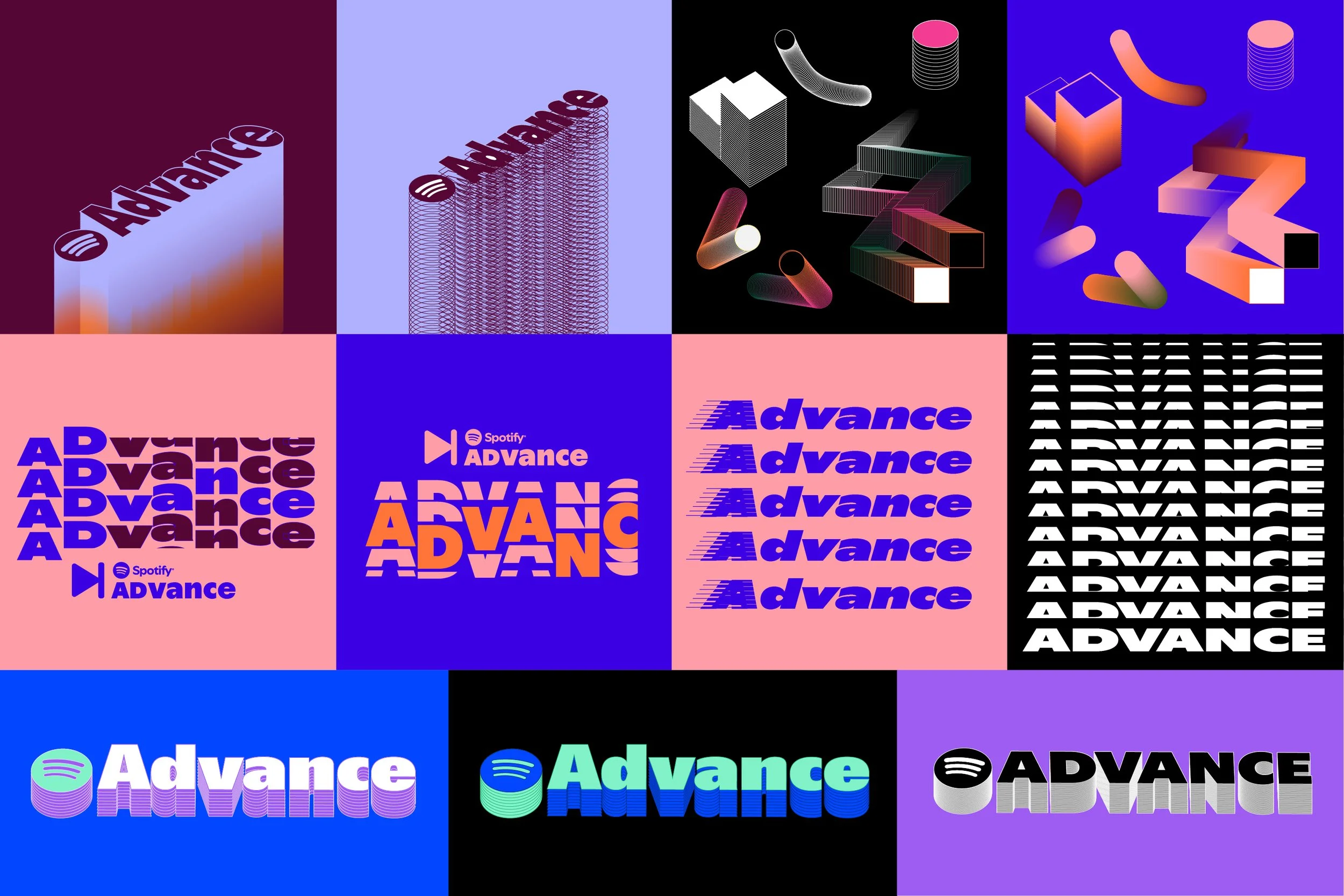
Logo & visual Ideation Process
A logo with movement
The Advance logo builds on Spotify’s familiar identity while introducing a stronger sense of momentum and progression. The wordmark uses dimensional color transitions to suggest movement from one state to the next, reflecting the idea of advancing forward while remaining immediately recognizable as Spotify. The flexible color treatment allows the mark to adapt across different environments while staying connected to the broader visual system.
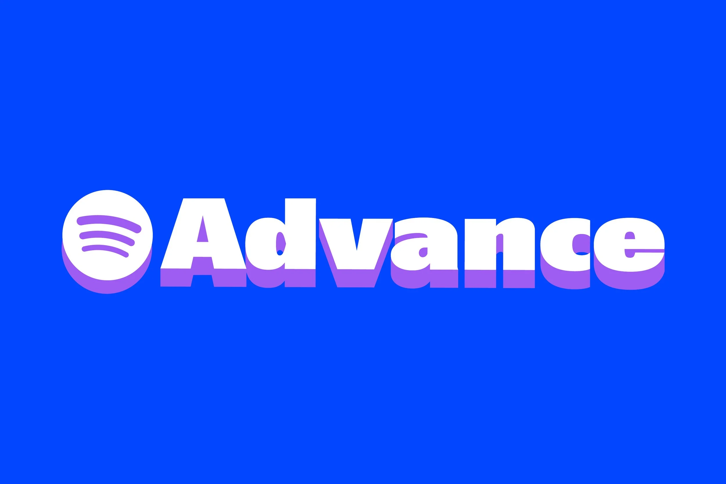
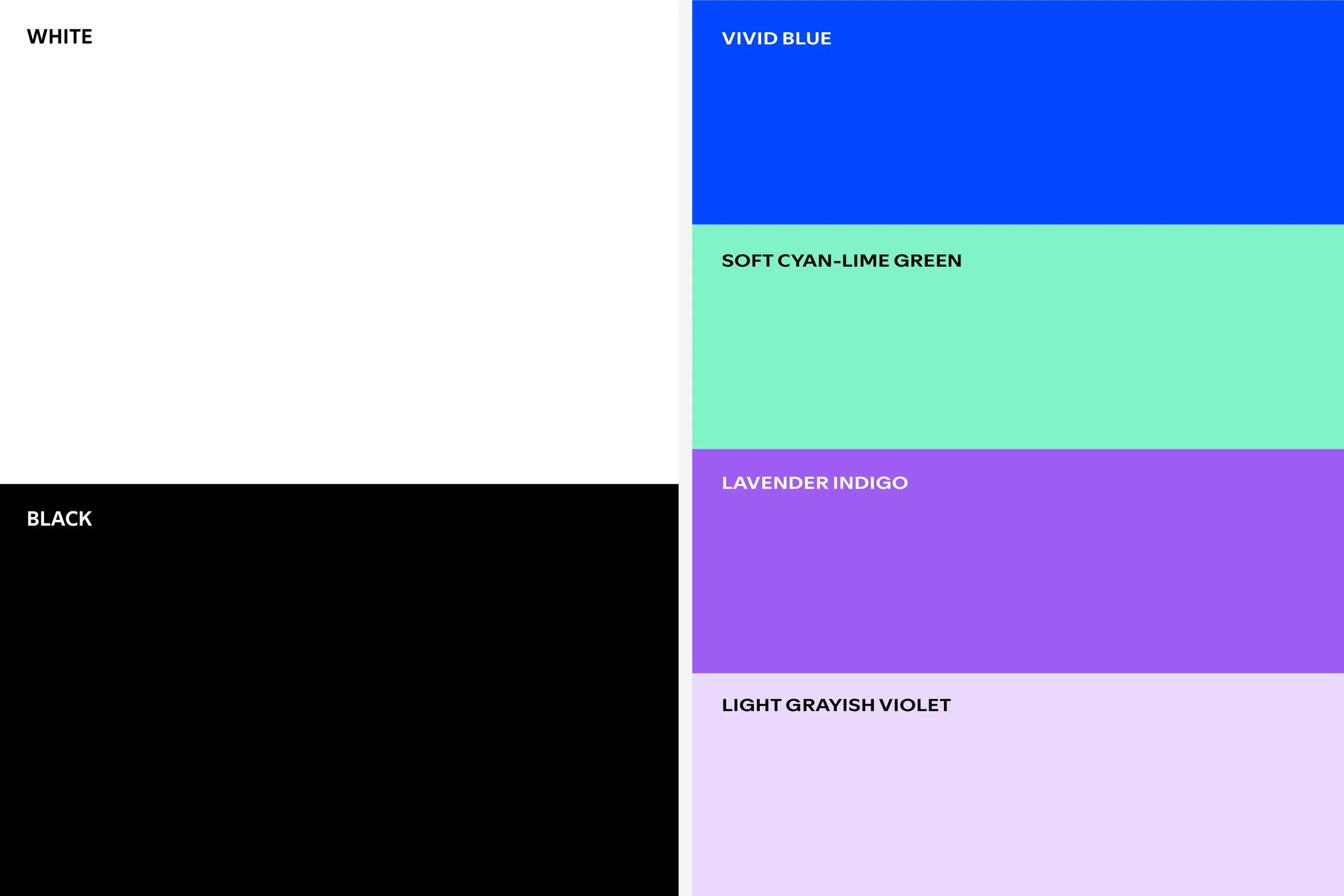
A system built for flexibility and transformation
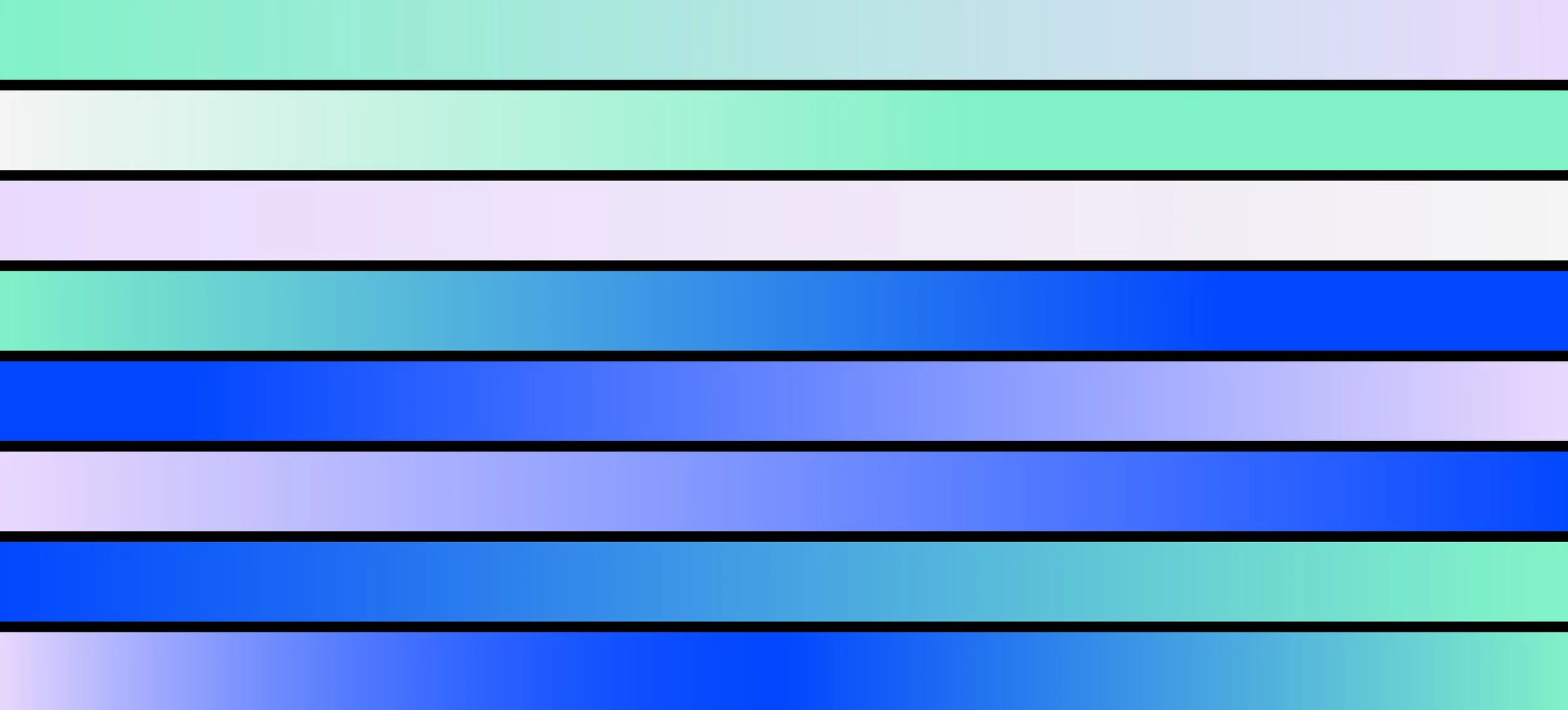
A vivid palette of electric blue, mint, and lavender gives Advance a distinct presence within Spotify’s expressive visual world. Gradients connect these colors through continuous transitions, adding depth and reinforcing the idea of transformation.
Together, the logo, color, gradients, and dimensional pathways form a cohesive identity built around one central idea: always moving forward.
The Big Idea — Pathways Unfold
The identity is built around a system of dimensional pathways that bend, intersect, rise, and move through space. What begins as an abstract line becomes a route forward—representing the journey from possibility to action and from an idea to its full expression.
The result is a visual system that never feels static. It is always advancing.
A Flexible Graphic Language
One pathway. Endless possibilities.
The core graphic was designed as a flexible system rather than a single hero asset. By cropping, rotating, scaling, and reshaping the dimensional pathways, the identity could generate an evolving family of compositions—from abstract waves to recognizable directional arrows.
This gave the event a consistent visual signature without requiring every touchpoint to look identical.
Master graphic → scale → rotate → crop → application
Bringing Advance to Life
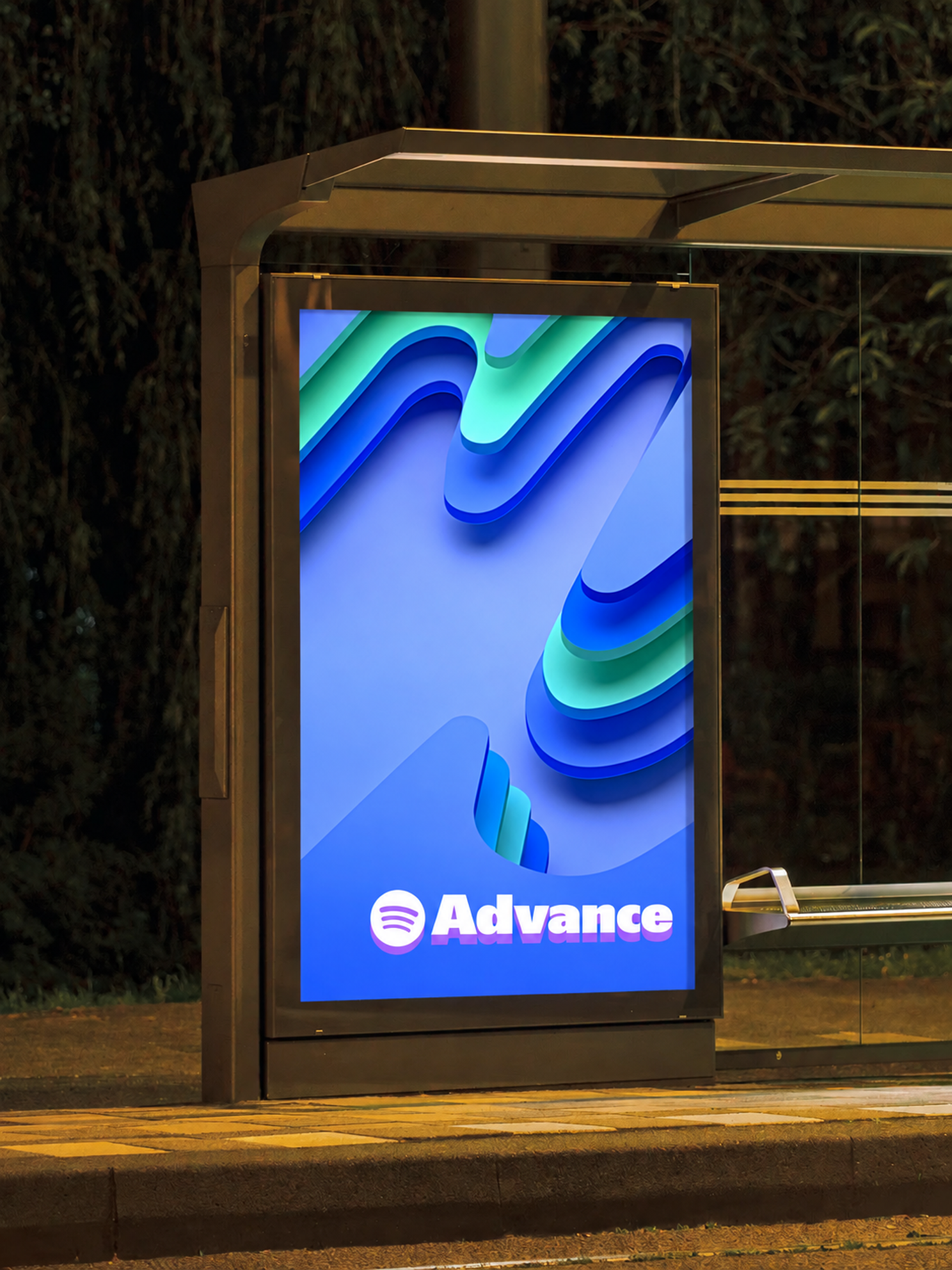
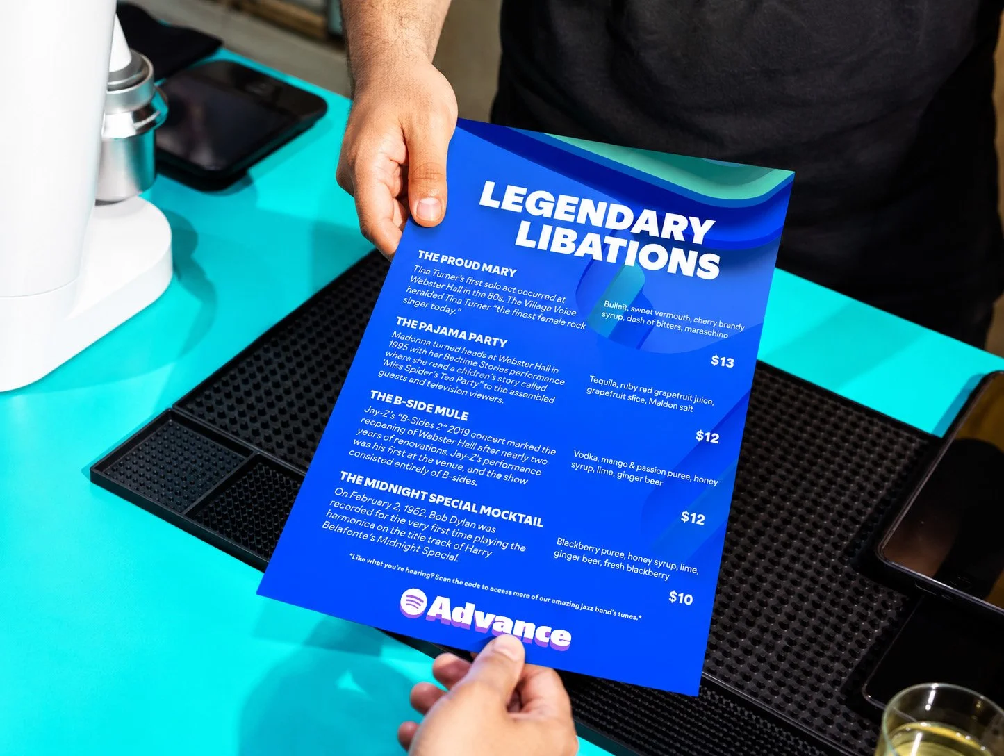
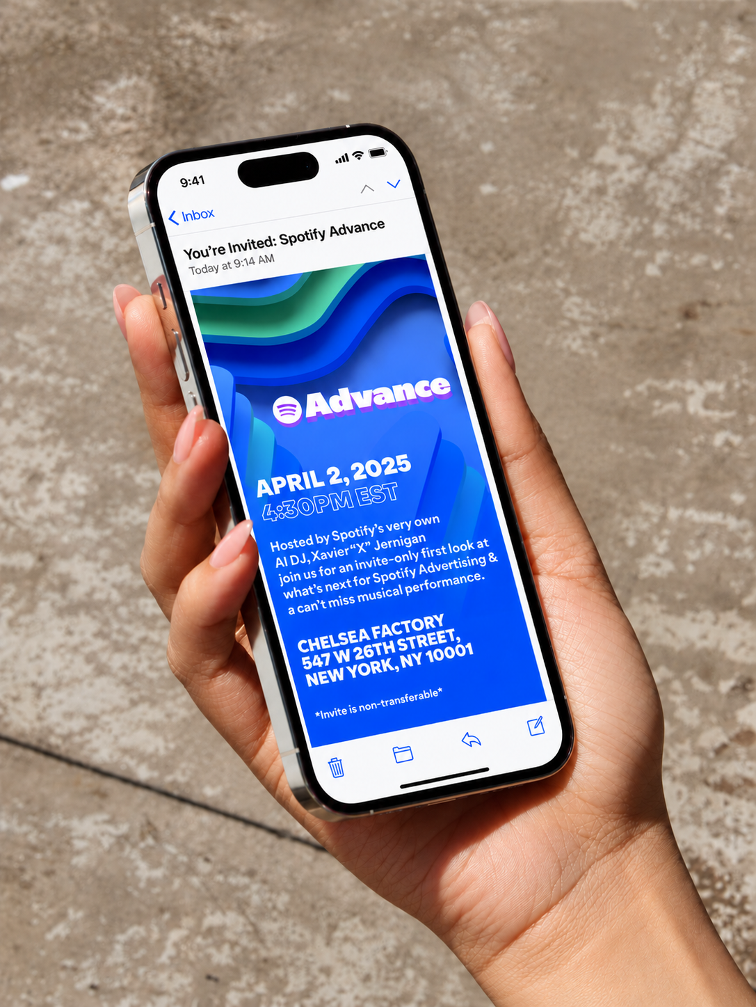
From identity to experience — the system was designed to move seamlessly from screen to space, creating a recognizable visual language across the entire Advance experience.
The Event
The next stage of Spotify Advertising
On April 2, 2025, Spotify Advance launched in New York at Chelsea Factory, bringing together people across advertising, marketing, publishing, media, and the creative industries. Spotify used the event to introduce major advertising updates, including Spotify Ad Exchange, creative capabilities, and new measurement tools.
Impact — Always moving forward
Spotify Advance needed an identity that could represent more than a single event. By turning the idea of advancement into a flexible visual language of pathways, direction, and transformation, we created a system that evolves alongside Spotify Advertising.