STAR - Brand System
Brand refresh for STAR Children Bereavement Services
A new logo, visual identity, and design system for a nonprofit organization that supports volunteers and children ages 8-16, advocating for safe, affirming summer camps for those who have lost loved ones.
SERVICE
Brand Research • Brand Discovery • Visual Identity Redesign • Brand Guidelines • Brand Assets & Training • Art Direction • Brand Refresh Launch Campaign

Background
STAR Children’s Bereavement Services supports children and families as they navigate grief with compassion, connection, and hope. The program creates safe spaces where participants can share their feelings, remember their loved ones, create meaningful keepsakes, and engage in fun activities. STAR reminds grieving children that they are not alone and that it is okay to smile, laugh, and make new memories while cherishing the memory of someone they love.
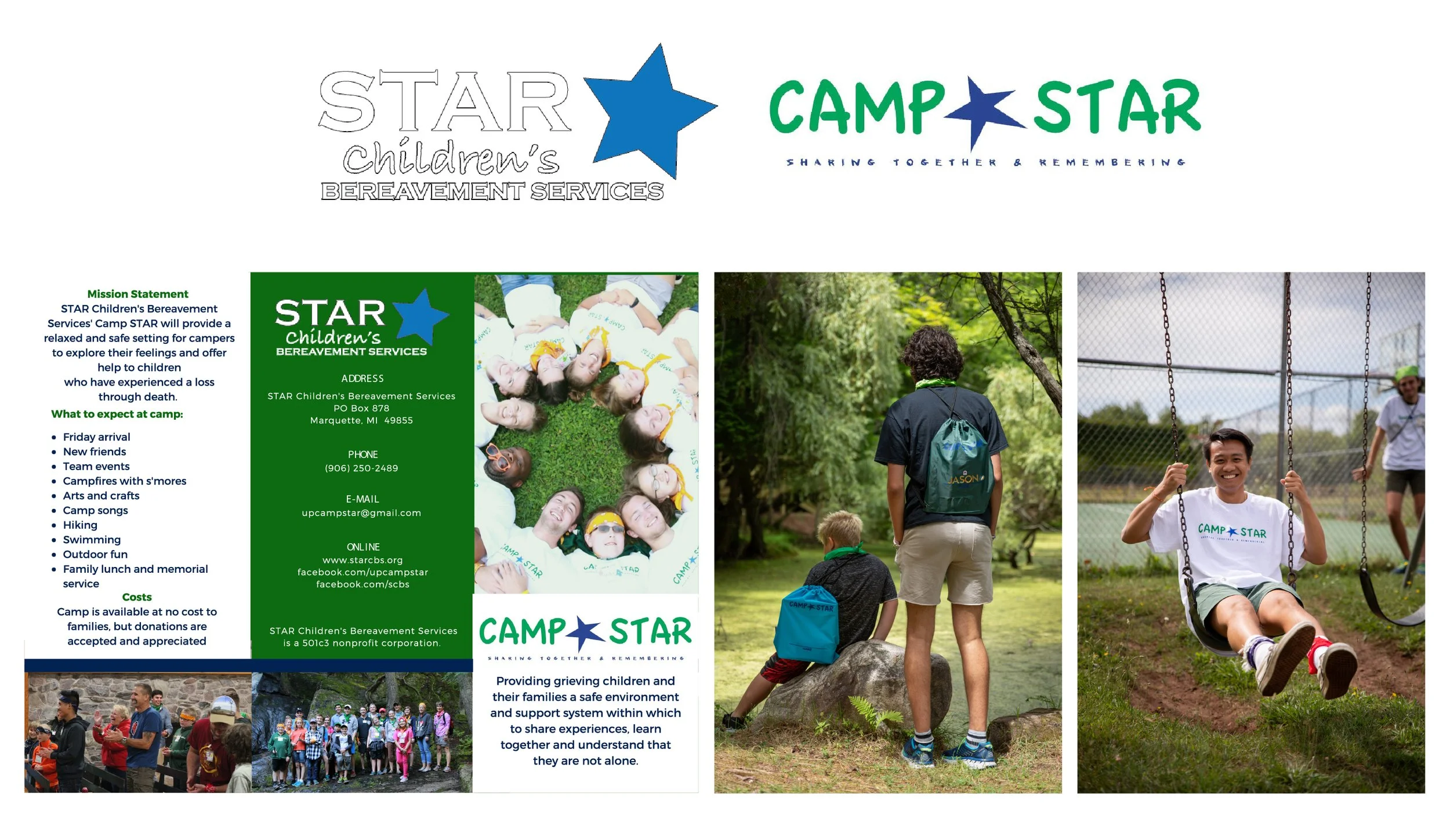
Existing brand assets
The Challenge
A Brand Ready for Its Next Chapter
As the non-profit organization evolved, so did its impact. However, its brand no longer reflected its current identity or the work it was doing. The logo and visual identity are outdated and do not resonate with attendees, making it difficult for them to feel connected to the organization.
The Solution
The nonprofit partnered with me on a comprehensive brand refresh, redefining its logo, visual identity, and digital presence to better communicate its mission and engage the communities it serves.
I began with research and stakeholder interviews to better understand the organization. By engaging those closest to the work, I identified the brand’s strengths, challenges, and opportunities for evolution while preserving decades of equity.
The result was a refreshed brand rooted in its history and mission but designed for the future—one that more clearly communicates its purpose, personality, and meaningful impact on the lives of the communities it serves.
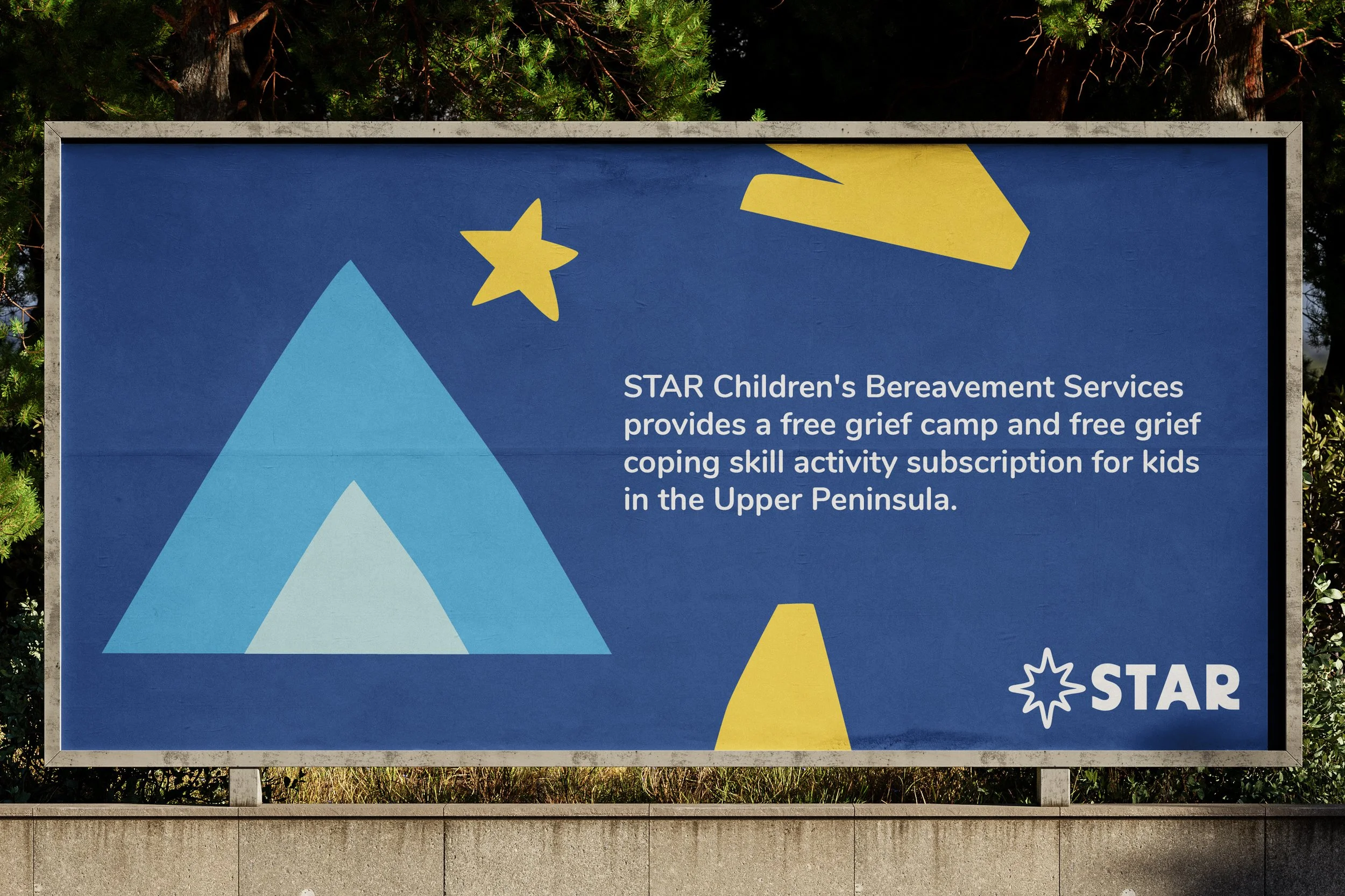
A logo that inspires growth and possibility
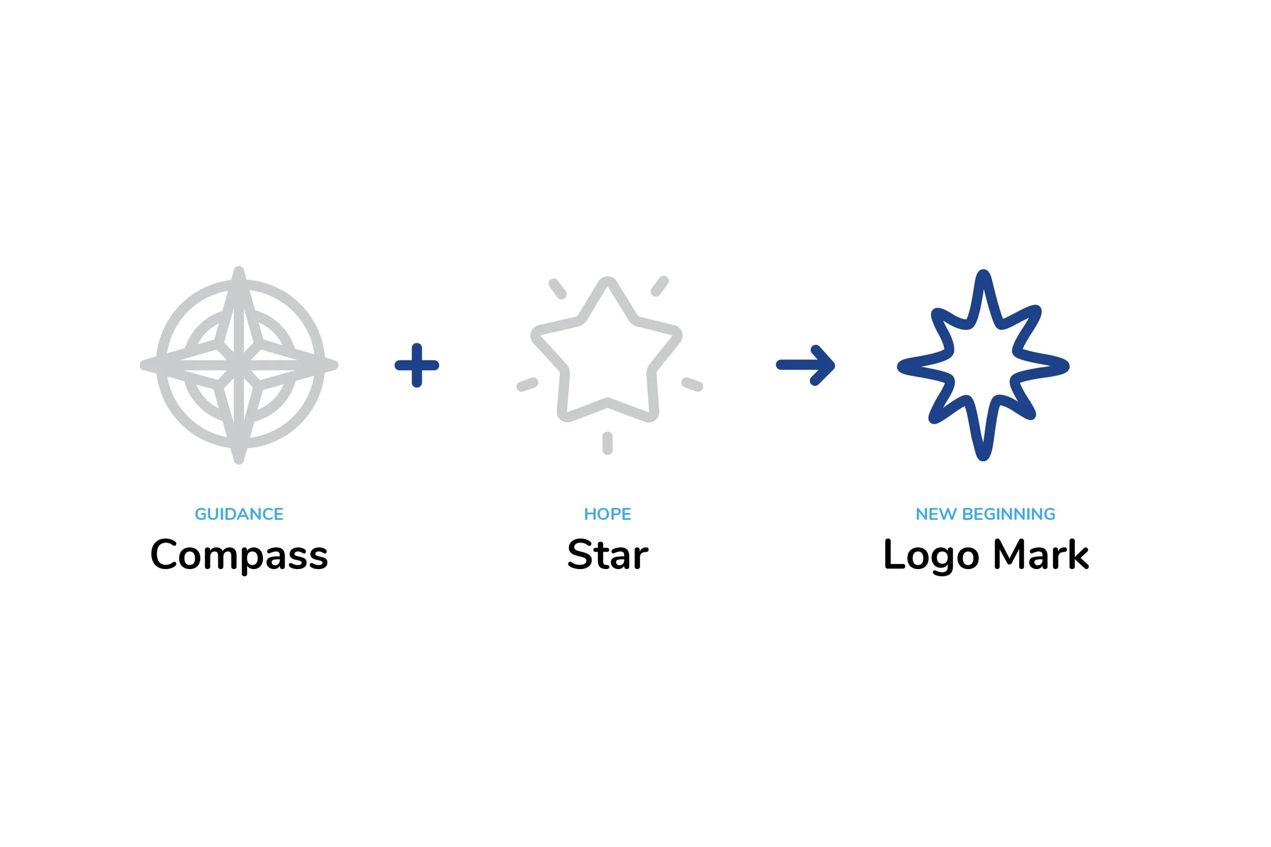
The logo STAR wordmark stands for Sharing Together and Remembering. It is paired with a custom icon—a stylized “star” that merges two symbols: a compass and a star. The star's counter conveys guidance and hope.
This logo is not just a design — it carries its own personality
The icon serves as the core of the STAR identity. Designed to feel dynamic, the STAR character communicates through its logo mark, a simple circular element that reflects the nonprofit’s mission.

Because healing isn’t about letting go. It’s about learning how to move forward while keeping their loved one in their heart.
Abstract Shapes That Tell a Story
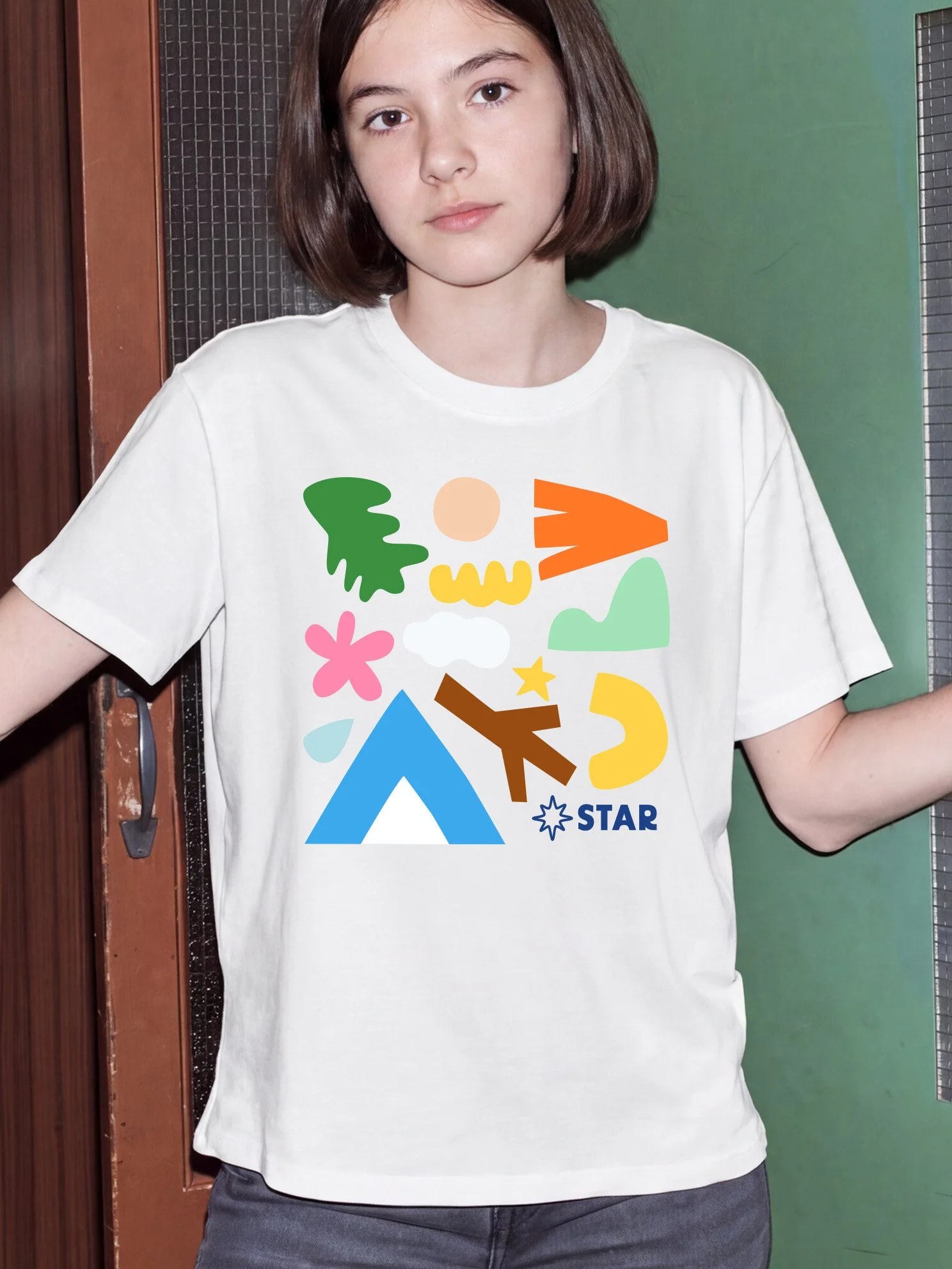
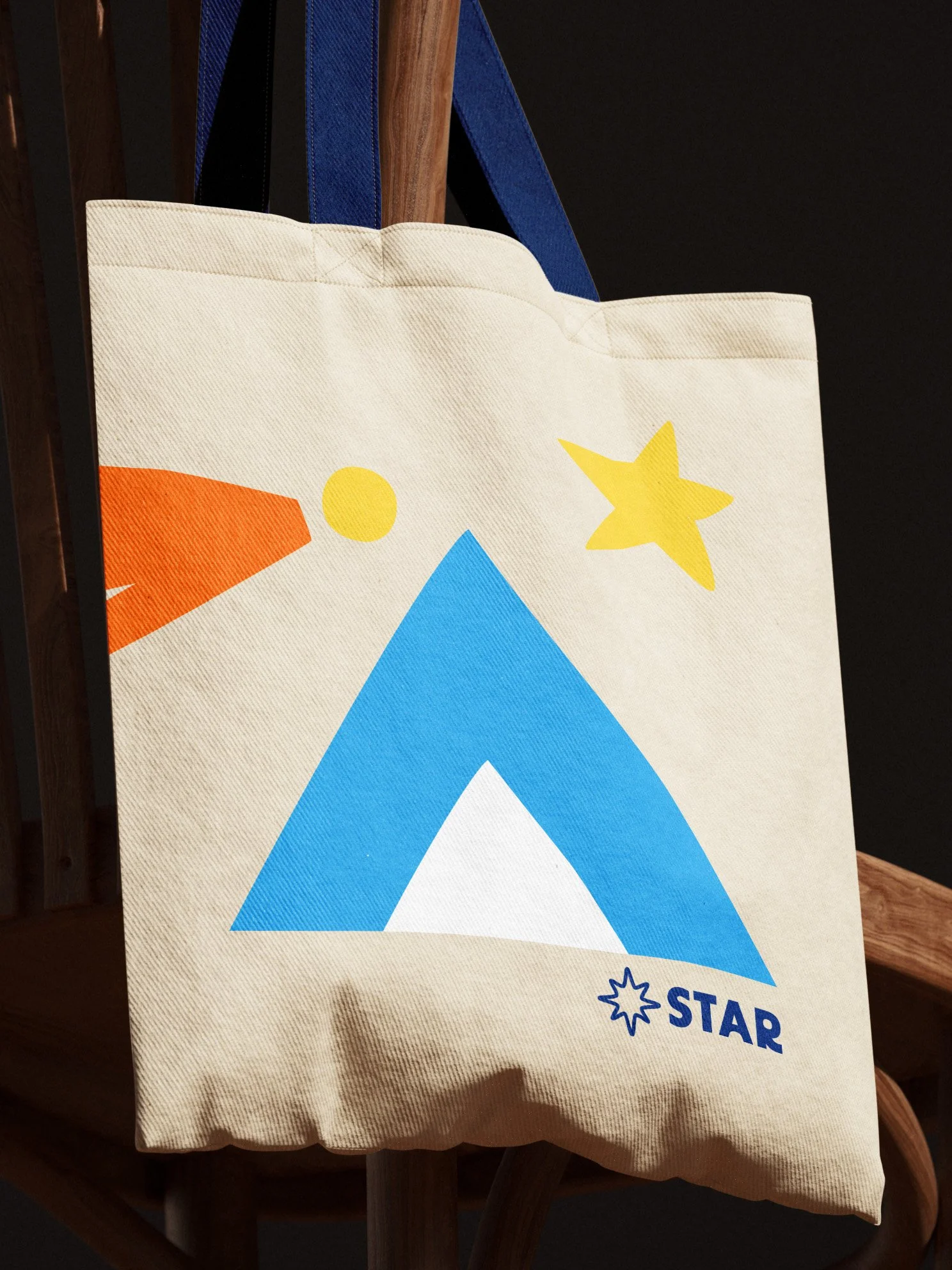
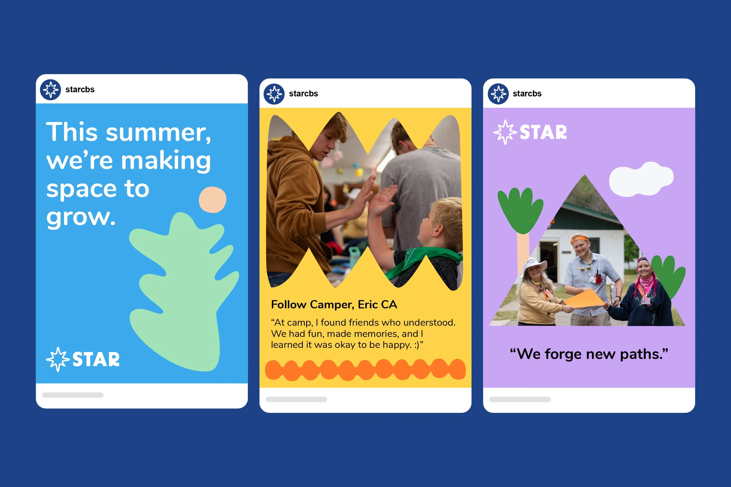
The abstract shape system I developed for the brand captures STAR's essence through clear, meaningful symbols. These symbols represent a range of concepts, from outdoor exploration to creative endeavors, effectively embodying the organization’s values. The handcrafted quality adds warmth and individuality to the brand's visual identity. Interestingly, the idea for these shapes originated in STAR’s summer camps, where one of the arts-and-crafts activities involved cutting paper. The abstract shapes are designed to be combined into various objects and can function as background elements, patterns, or photo frames.
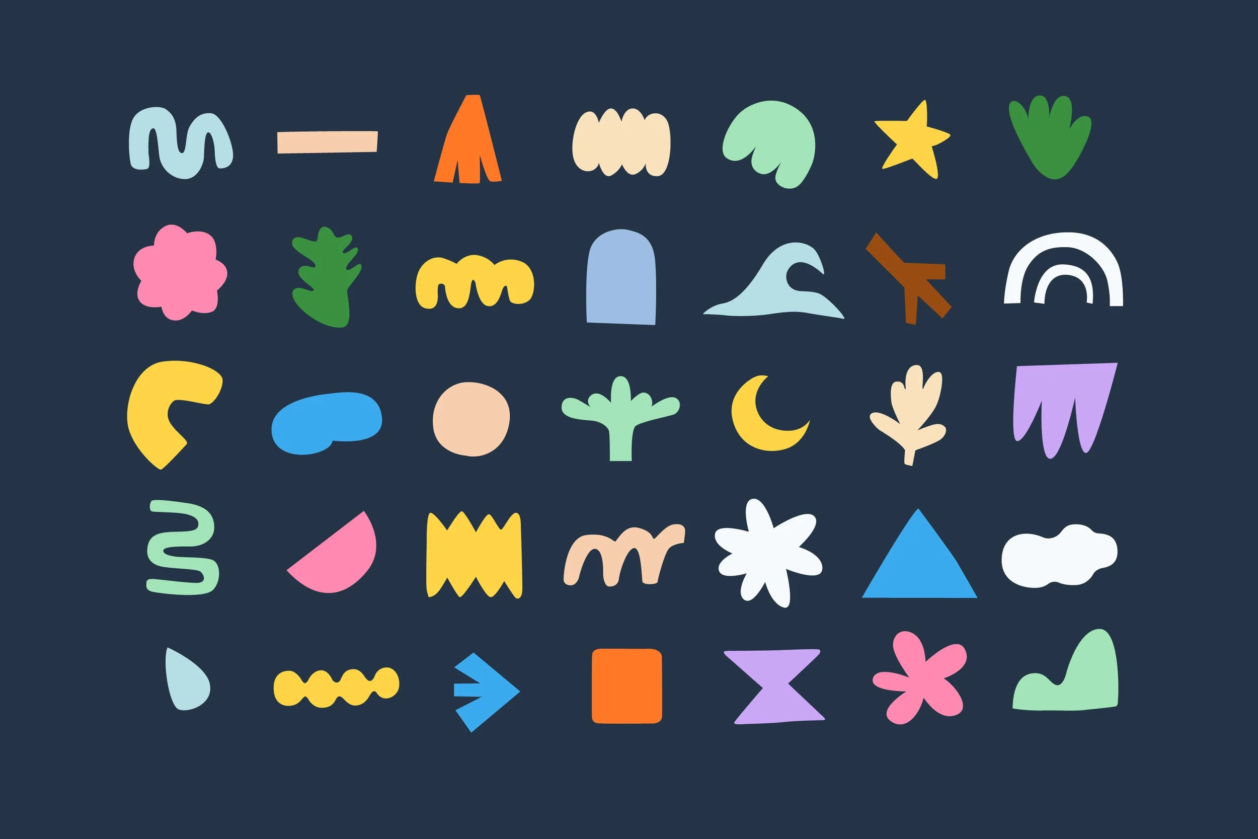
A vibrant, flexible design system
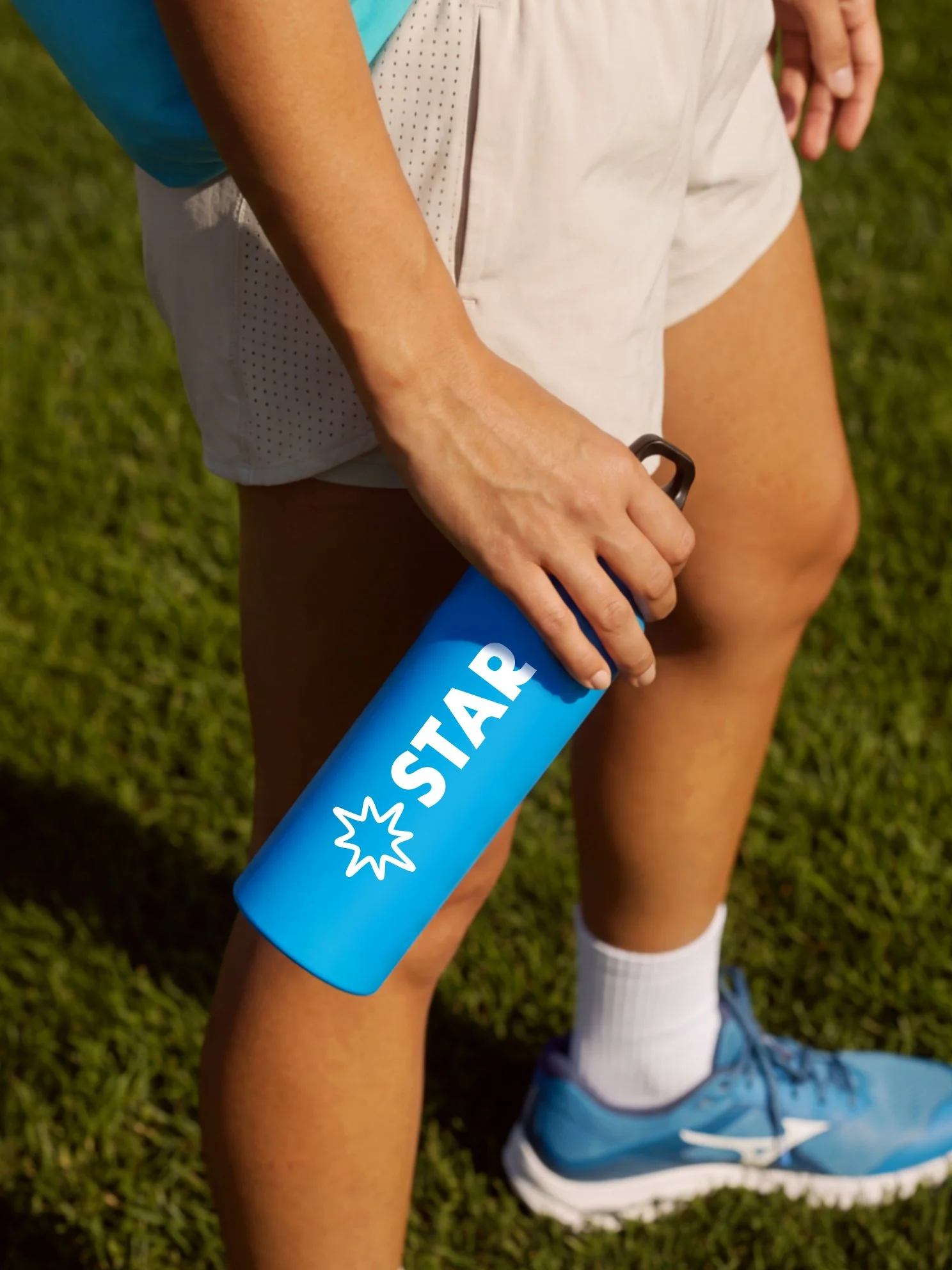
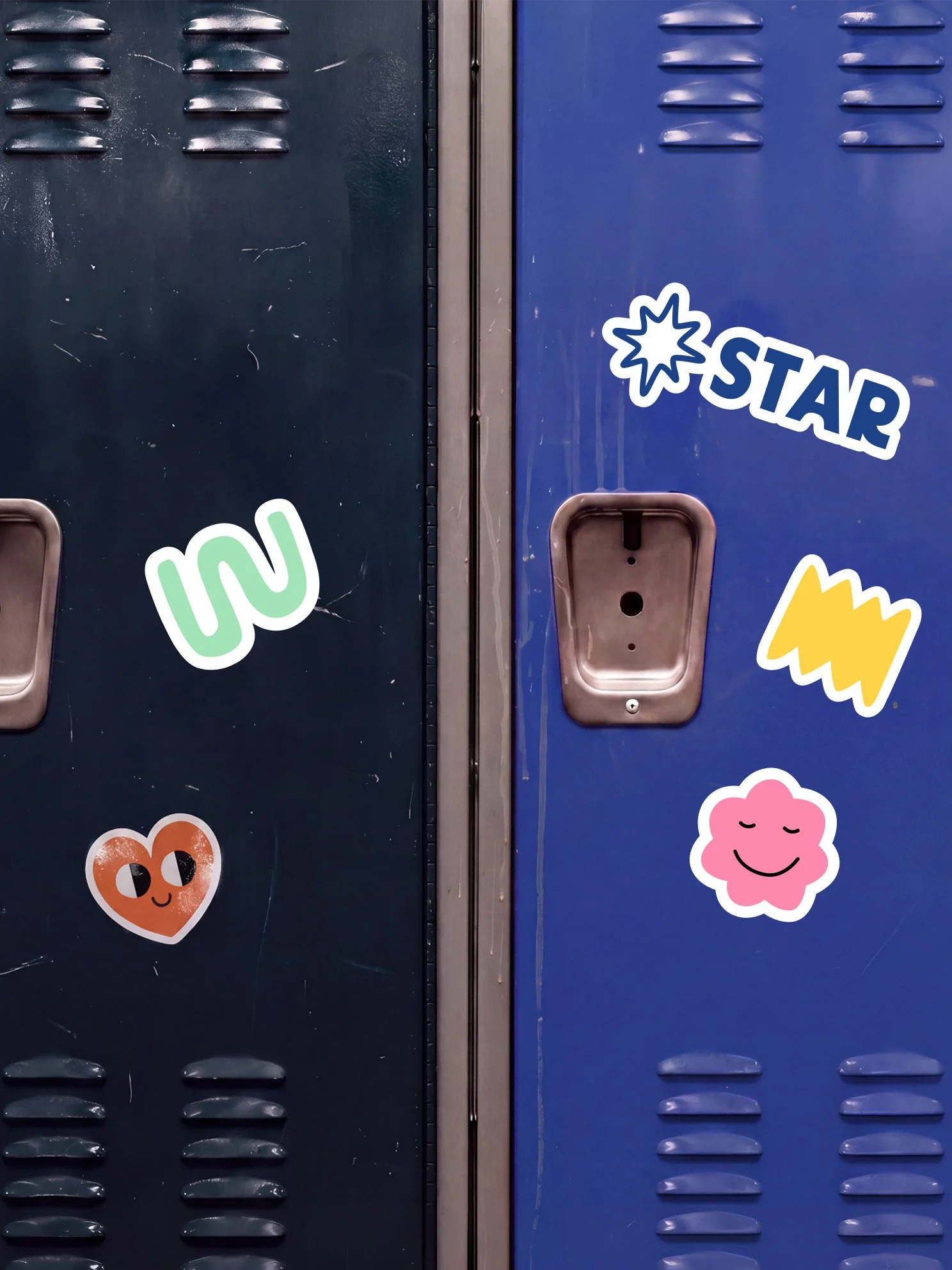
The design system combines structure with creativity, featuring clean layouts, bold colors, expressive typography, and handcrafted iconography.
Project Credits
SERVICES
Brand Transformation
PROJECT TEAM
I-Nu Yeh(Creative + Design)
Victoria Leonhardt(Head of Communication)
Ally Anderson(Camp Counselor)
Sydney Garlitz(Communication)
Jack Vander Lugt(Camp Counselor)
Ashley Hernandez(Socail)
CLIENT
STAR Children’s Bereavement Services
YEAR OF COMPLETION
2025
ISSUES
Non-Profit